Page Hierarchy and Information Architecture
BUSINESS PROBLEM AND GOAL

XTIVIA's website was built with an on-demand mindset. They build custom technology solutions for businesses using an extensive list of application expertise.. They continue to be thought leaders in innovative technology integration. As new technologies are introduced or are trending in the market, it is pivotal that their public site, landing pages, and sales channel has contextual marketing for their clientele.
As a result, XTIVIA has created an extensive content library, mostly consisting of one-off pages that support a once innovative application or service. These pages have saturated the site, and often have high bounce rates. My team believed this is caused by quick page iteration without templates. These pages also have an inconsistent brand voice and design. The turnaround is necessary to keep up with market trends and XTIVIA’s fast growth. As we looked at conversion rates and sales goals, our team decided implementing UX best practices would be pivotal in customer retention.
As a result, XTIVIA has created an extensive content library, mostly consisting of one-off pages that support a once innovative application or service. These pages have saturated the site, and often have high bounce rates. My team believed this is caused by quick page iteration without templates. These pages also have an inconsistent brand voice and design. The turnaround is necessary to keep up with market trends and XTIVIA’s fast growth. As we looked at conversion rates and sales goals, our team decided implementing UX best practices would be pivotal in customer retention.
MY ROLE

As a part of this initiative, we were tasked with establishing a page hierrchy and establishing an information architecture. This would allow our team to produce marketing materials with consistency in voice and design, potentially increasing page conversions for one-off pages. We created a comprehensive website inventory to give us a clear picture of each page's designation within the hierarchy. Everything would be identified as a Parent, Child, GrandChild, or Great GrandChild page.
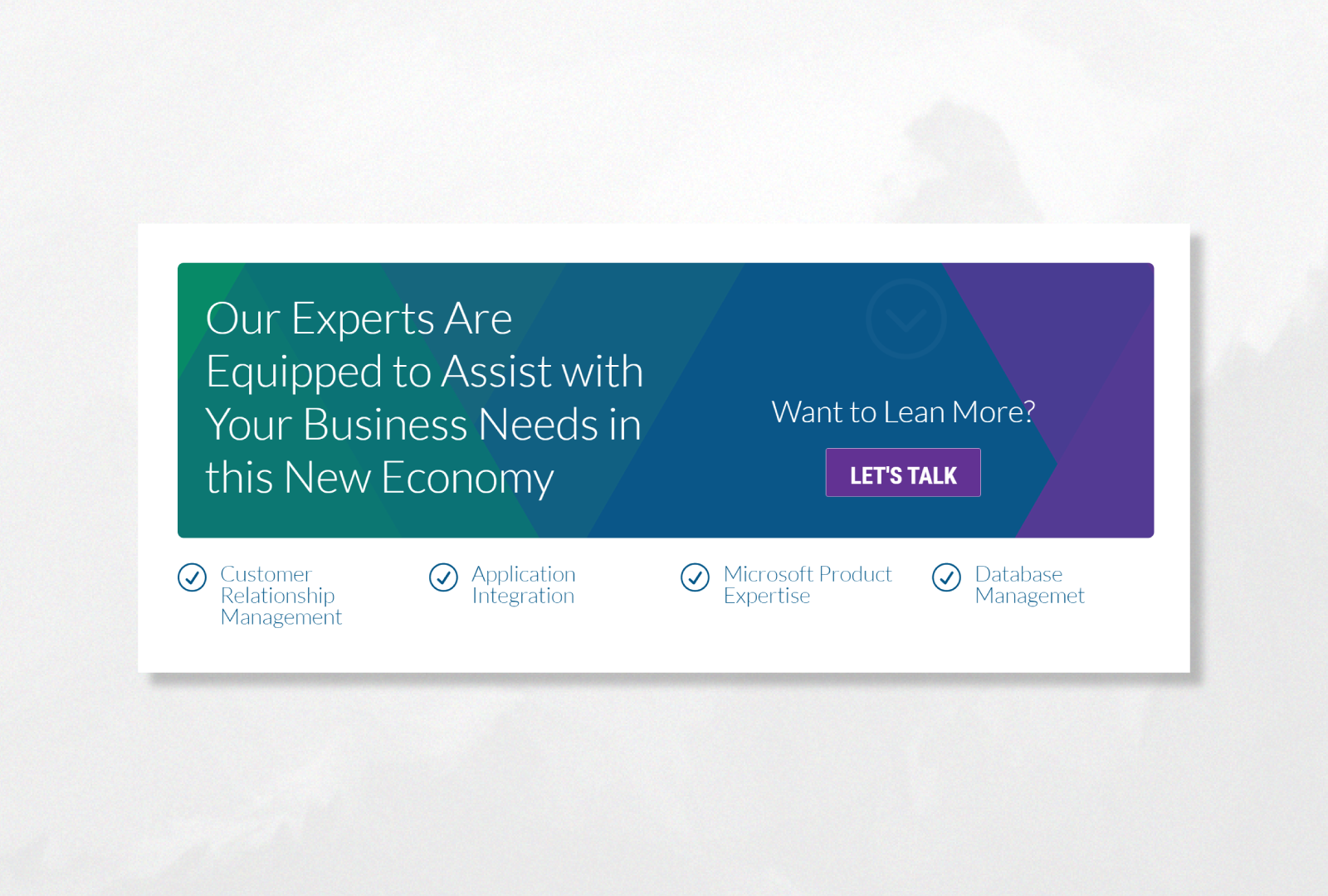
My role in this project was to analyze the current site pages for opportunities to improve based on our competition and UI/UX best practices. My personal goal was to reutilize the wealth of content XTIVIA already had and to repackage it into a simplified experience within the bubble of a bigger project. This included creating new designs for common site elements including Testimonials, CTAs, and Headers.
My role in this project was to analyze the current site pages for opportunities to improve based on our competition and UI/UX best practices. My personal goal was to reutilize the wealth of content XTIVIA already had and to repackage it into a simplified experience within the bubble of a bigger project. This included creating new designs for common site elements including Testimonials, CTAs, and Headers.
DISCOVERY
XTIVIA is a B2B company, and our brand is catered toward 40 to 70 year old male decision makers. These company’s are often seeking help with a product they already own, with a dedicated budget to its adoption. Using Google Analytics and Heat Mapping we put together a list of the best performing webpages. We decided which page elements were most common and most appealing to adapt into a template. We discovered that our users weren't scrolling more than 2 times, or going below the fold, even on our most popular pages. Tightening up our content and optimizing for laptop and tablet users was crucial, based on our demographic.Competitive Analysis/ Industry Trends
I used 10 websites as a reference in deciding on new elements and site features. The main takeaways were to implement fixed-width pages, breadcrumbs, negative space, and multi-faceted widgets with contextual and useful branches.
PROTOTYPING
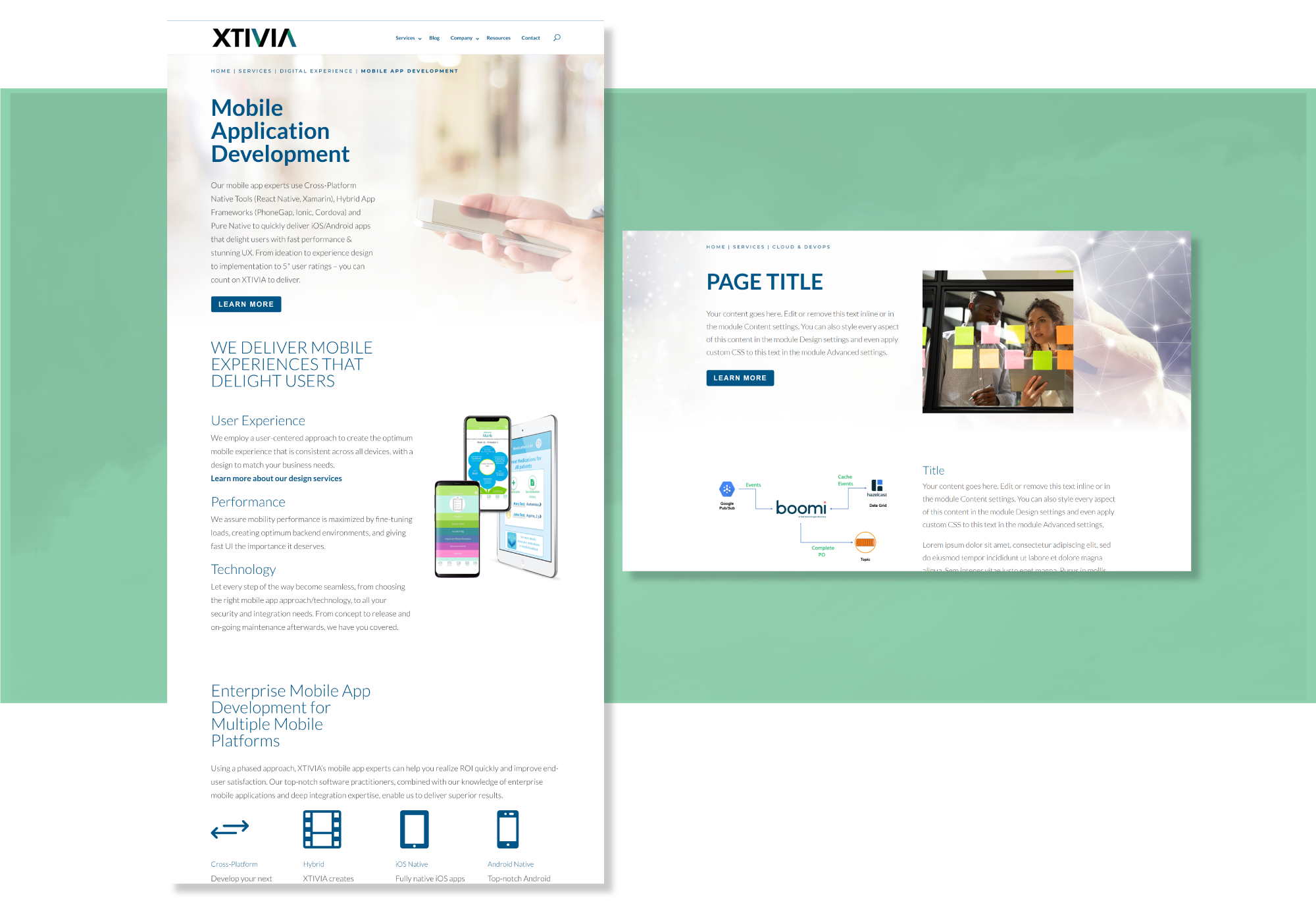
Using Wordpress I created Interactive Mock-Ups for each page element. Along with these elements I created a Master Template, and sample template for each hierarchy level. I used a hidden pages within the production environment to demonstrate design ideas.

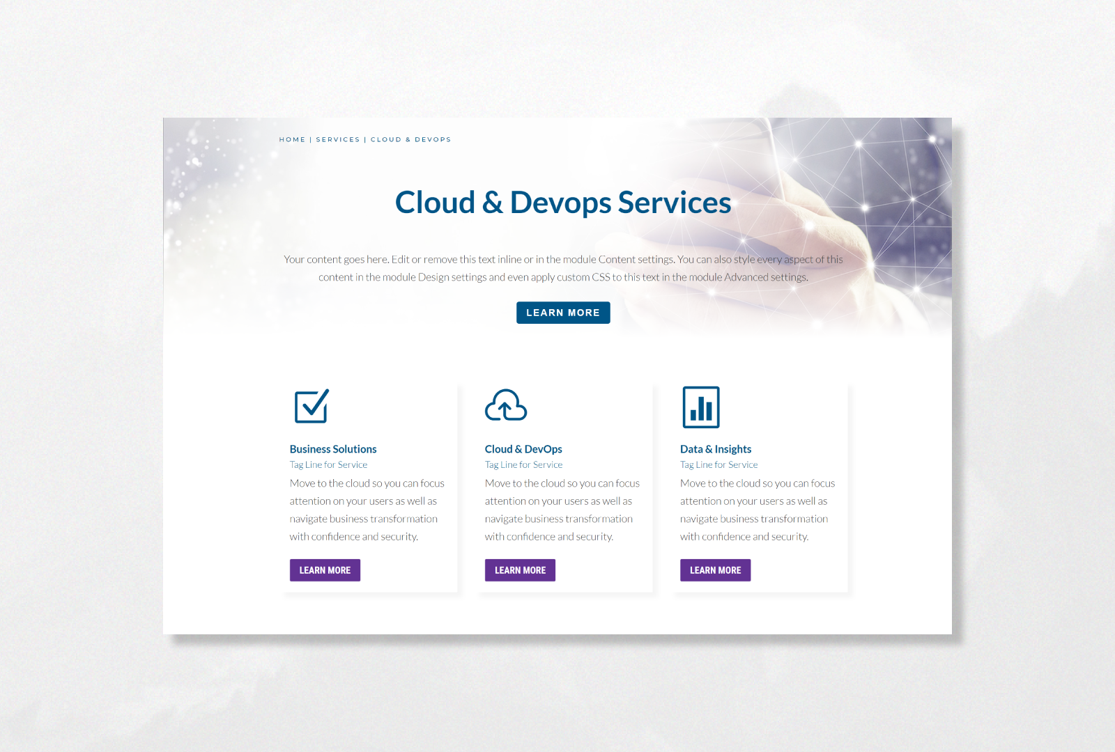
I compressed the header to bring more information and calls-to-action above the fold. XTIVIA also had strong breaks between sections. I created a template that fades the header image into the first content element smoothly.

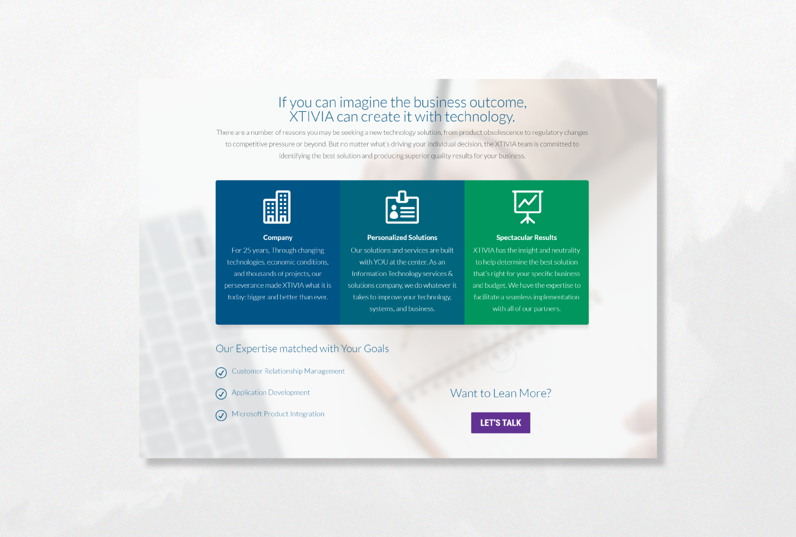
XTIVIA often has examples of their excellent reputation on each page. This change was made in order to cater to the specific Service or Product on the page, and as another opportunity for the call to action, alongside it in a tight widget.

The previous testimonial widget encompassed the entire screen, and added unecessary scrolls to the page. The new widget is sleek with links added that are relevant to a user researching the company