Learning Services Website Redesign
BUSINESS PROBLEM AND GOAL
The Learning Services department at Cherwell acted as a company within a company. We provided training resources to internal and external customers. Our website, nested within Cherwell's main site structure, acted as our Marketing and Sales pipeline for anyone interested in learning the product. This included payment processing, scheduling, and course information for each class. In 2018, Cherwell launched a branding initiative that affected every department.
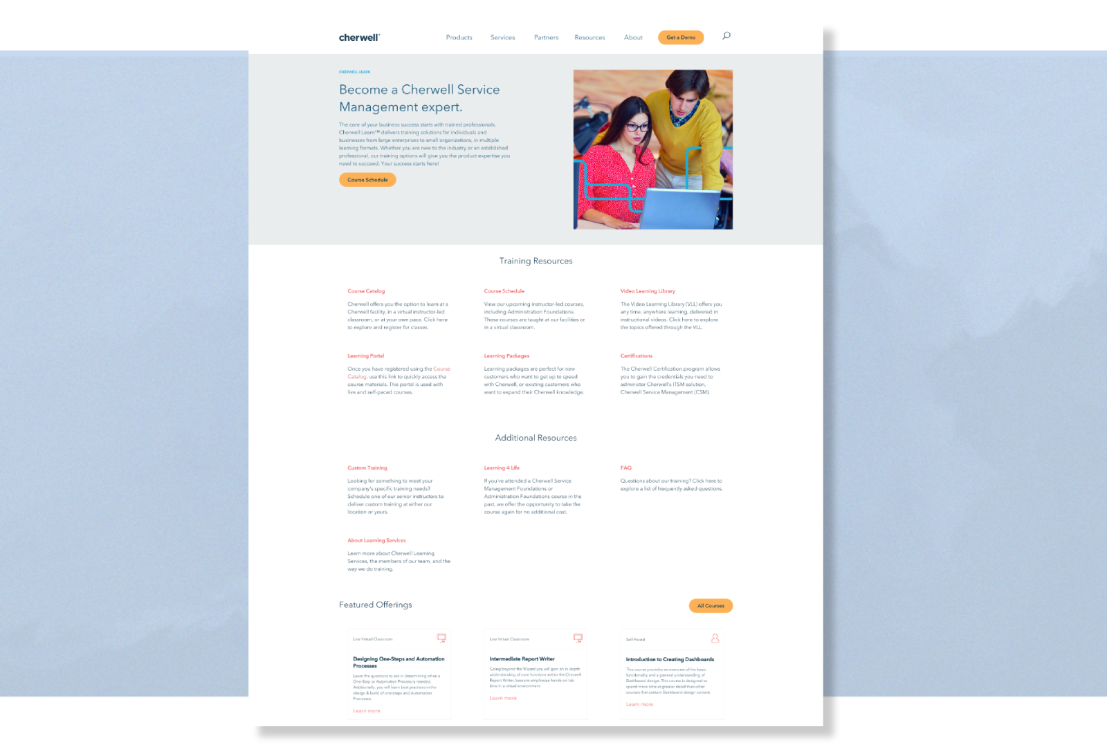
During this transition we revamped every page on the site. Our team took this as an opportunity to review our Learning Services pages for their usability, content, and overall user experience; along with compliance for the rebranding initiative. Ideally, this would reduce the amount of support tickets and administration needs from our department’s training coordinators. In addition it would refine our site processes in anticipation of company growth. This project was completed prior to Cherwell Learn.
MY ROLE
My role was to redesign the website, and architect the user flow between the site and the training portal. I needed to research the main pain points of our current internal and external customers and propose meaningful changes based on the discovery. I would then design and implement these changes side-by-side with the re-launch of our brand.
DISCOVERY
Cherwell is a B2B company, selling an ITSM software solution. The majority of IT professionals are 34 to 44 year old males. For this project I started with my teammates, interviewing them about common support questions and administration headaches. I conducted interviews with people inside and out of Learning Services to outline improvements we can make. We also had a stellar reputation with our training customers, and chose several companies and partners to also provide feedback.The survey surfaced one of the key takeaways that guided our design changes. Our customers felt a disconnect from our website and the on-demand video training portal, which was our flagship offering as a department. We housed a complete course catalog on the company's main site, but the distinction between the type of course they were taking, and which portal's they would have access too, wasn't clear. There also wasn't a clear indicator of the pricing, and what was included with each offering.
Competitive Analysis/Industry Trends
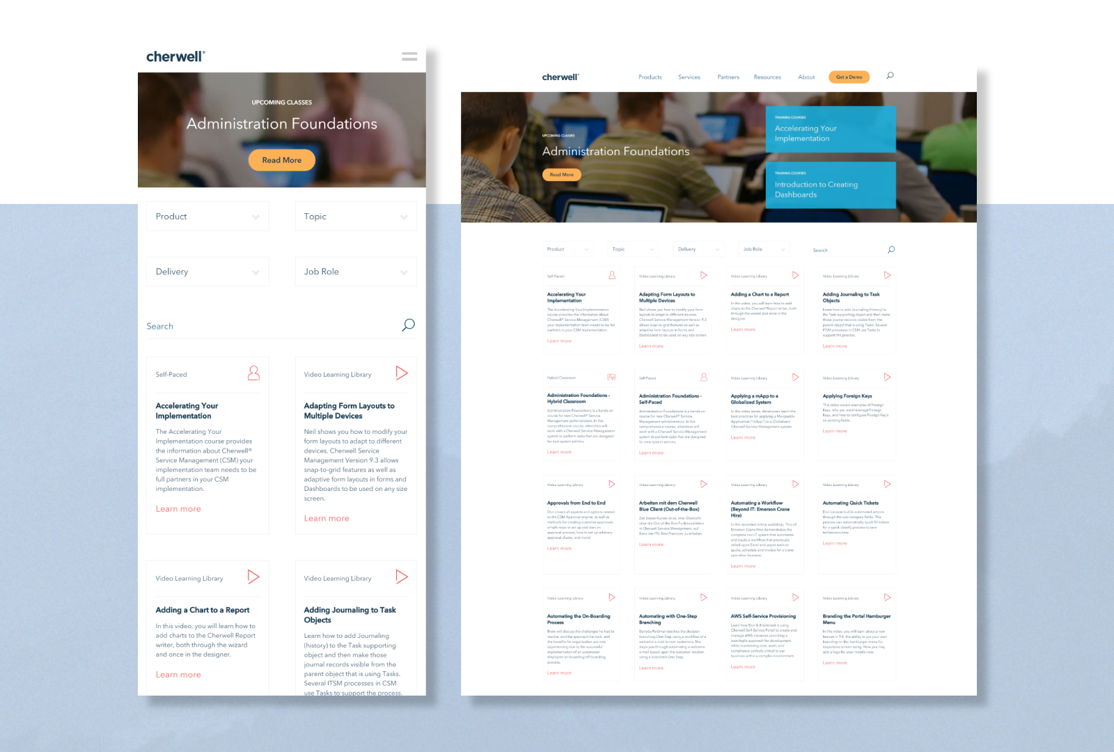
While sticking closely to Cherwell's new Branding Style Guide, we also looked closely at a similar company’s user flows when connecting to their on-demand training platform. Indicating the type of course through iconography was popular. This company used material design to display information dynamically. We implemented this functionality and more.
PROTOTYPING
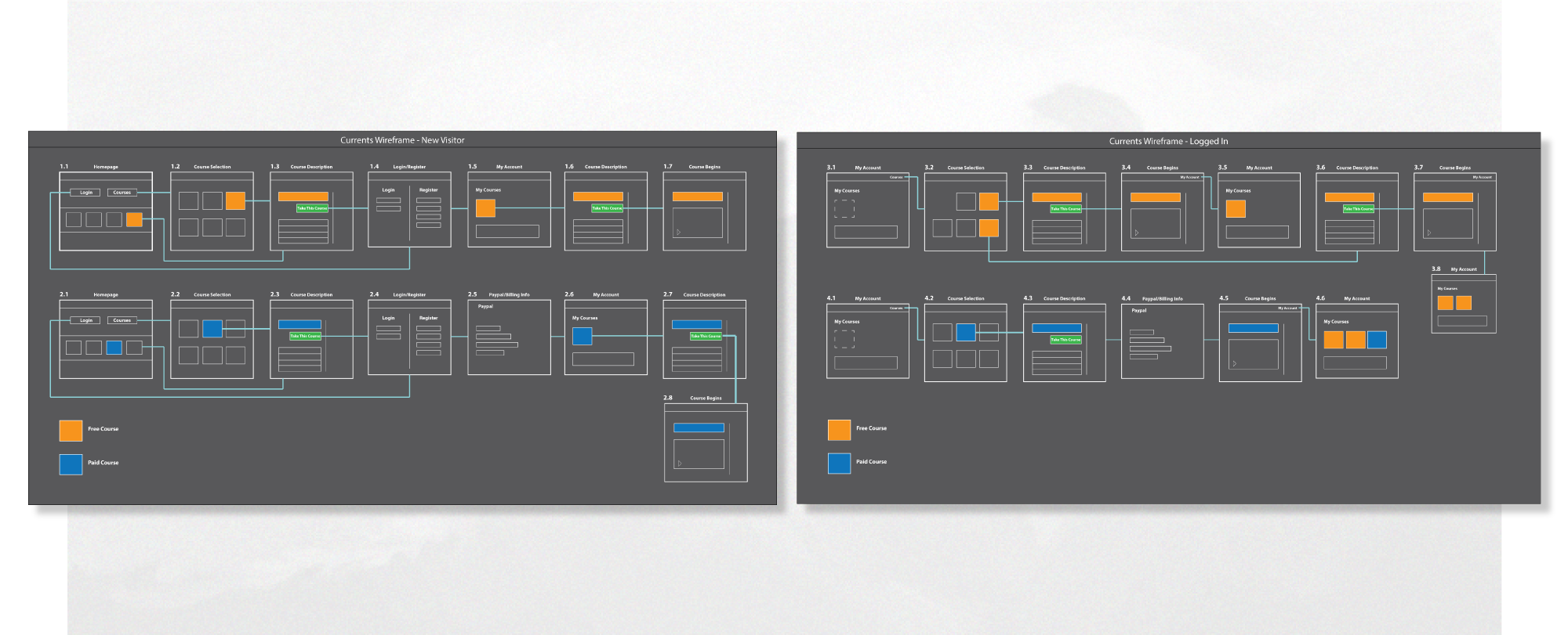
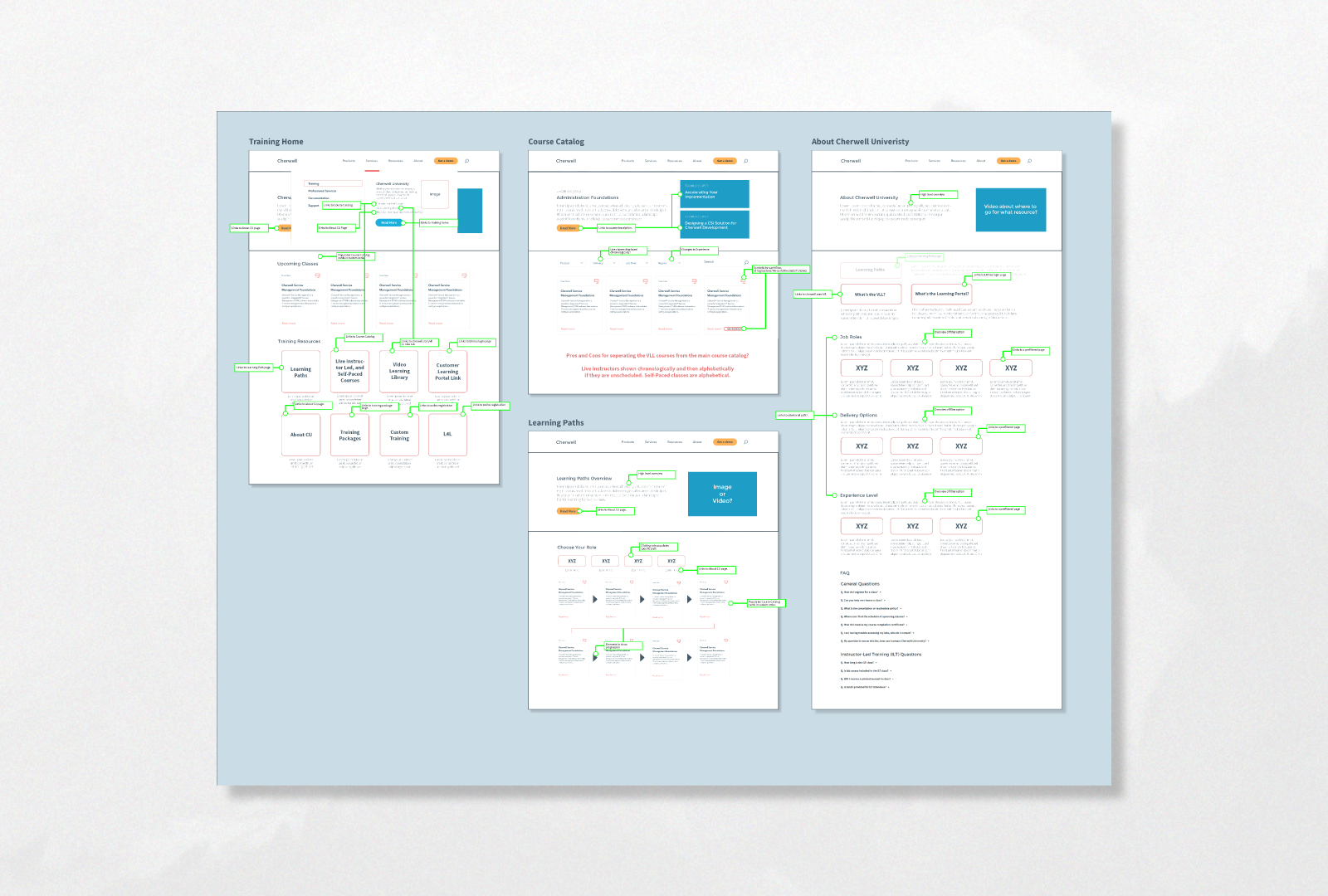
I created a wireframe for my proposed changes using Adobe Illustrator, and conducted several workshops to refine the process. We needed to have users in different states when they first accessed the site, so we created user stories for almost every scenario. I created branches stemming from our Learning Services home page.
I worked closely with our Sitecore developers to create a Course Catalog filtering system (material design). This catalog provided options for a user to search based on their company role, a Cherwell Software feature, their company's version of Cherwell, their preferred learning method (Video, eLearning, In-Person, Virtually) and more!

BUSINESS RESULT
As a result of these changes we had a significant decrease in support tickets for our department. We had an influx of users to the Video Learning Library as a part of the company's growth, and ease of use. Our department training coordinators had more time to focus on customer relations and questions specific to Instructor-Led classes.We were a full fledged revenue generating department at this point, and the redesign automated most of it. The customer feedback was extremely positive, and on more than one occasion the services offered on our site won us business over our competitors.